Friday, 12 February 2016

Wednesday, 27 January 2016
Q4 and 5 TA
What I did before was add more shapes because I thought that this would make it look more appealing to the reader, however after looking over my magazine TA I realized that the shapes make my magazine look like it is for more of a younger audience. So because my TA was originally for a teenage/adult reader I removed some shapes so this boosted my TA up to make it look suitable for a teenage/adult audience, however because I thought some shapes were appealing to the reader I left these in so my TA became an older teenage reader.
Thursday, 21 January 2016
Q3 institutions

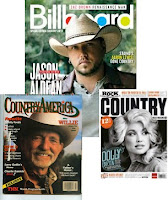
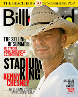
 My original institution choice was IPC,because they produce more country magazines and less rocky themed magazines, so because my magazine is a country and western, I thought this institute would suit my magazine the best and would most likely publish my magazine. IPC are a magazine company that produces magazines for a mixed age group, so mine would have suited them in that aspect because my magazine is a modern magazine for a teenage TA. This is a magazine called NME who is produced by IPC. This magazine features 'Paramore' who is a modern music artist, this suggests that this specific magazine is targeted at teenagers/young adults, so my magazine would sit their company.
 Another magazine institution
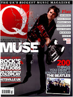
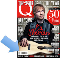
  that I looked at was Bauer media. At first I thought that this magazine company only produced rock themed magazines, however after all my research I have found out they produce modern magazines like Q who use modern artists on their front cover. I analysed Q magazine a lot in my magazine research and found out they target a mixed aged audience, because I have seen modern and older artists feature on their front cover. Also I feel that they focus on the theme of rock and pop because the artists on the front cover are usually rock artists or pop artists, or even sometimes pop artists dressed like rock artists. I feel that my magazine would suit this company because they produce magazines for a modern audience and they produce all types of magazines with different genres, but after looking into the magazine types that they produce I found out there is a lack of country magazines, so my magazine would work because it is modern and will attract a new audience of country magazine readers to their company.
 Another institution that I analysed was 'Hand media' because they produced Maverick magazine, which is a modern country/rock magazine. I used some ideas from Maverick magazine in my magazine because I felt that this related well to a modern audience and made the magazine look intriguing to the reader. This company is not as big as the likes of Bauer but is still a good company because they produce modern country magazines which my magazine is. As you can tell this magazine uses a modern well known artist on their front cover, which attracts a larger audience. I might not use this institution because they already have a modern country magazine so they might not want to take on mine.
Overall I will use Bauer Media because their company has a lack of country magazines so I feel that they would want to take on my magazine so they can attract interest from a larger audience which will enhance their reputation further. This is a modern magazine company which can relate to my magazine and because they are such a big company, this will advertise my magazine more to people so they will want to buy it.

My magazine would go between 'What Bike?' and 'Your Horse' because my magazine starts with 'YE' and as it runs down in alphabetical order it would fit in here. There is a gap in the market for Bauer as they have very little 'Country and Western' magazines, so this tells me that my magazine will be successful as Bauer would want to attract a larger TA. However it might not be as successful as my magazine would be placed near the bottom of the page so it would not stand out to the reader unless they went to the bottom of the page.
 Bauer not only distribute magazine companies, they also produce 'Radio, Digital and TV' stations so my magazine would be avertised by each of these. This would be successful as it would make my magazine gain popularity with a larger TA and can be published by different types of media. Cross media convergence is also created here: Bauer use TV to advertise their brands so my magazine could be shown between TV programs so more people would notice it. My magazine would work in cohesion with Bauer as I have included social media links in my magazine and have included iTunes links for country music on my front cover.
 The TA of Bauer really suits my magazine as they produce magazines for a Millenials audience. This proves that my magazine will be successful with Bauer as my TA is inside their TA boundaries. Furthermore for their image to represent the Millenials, they use young, vibrant people, which works well to show the TA of their idustry.

Friday, 15 January 2016





Tuesday, 12 January 2016
Q1. Evaluation of front cover, contents and Dps

 I have adhered to conventions by having a single/solo male singer on the front cover, this draws in females by having a strong representation of a male country singer, where the artist is represented as being good looking and modern. Also I used the theory of Mulvey 'the male gaze' on my front cover which also draws in females because of Olly's looks. However I also have him wearing headphones and a plain top to make him look 'cool' because it makes it look like a modern country artist which could also attract a male audience to the magazine. This is a code that is used in most teen magazines to attract a wider, younger audience.
I have also adhered to conventions by having trees in the background of my front cover. The reason I did this was because I wanted to adhere to some conventions but also it is good for a background to blurr because there isn't much detail and it has a green nature colour which adheres to the country theme. However it also lets Olly be the main feature of the front cover because there no distractions.
 The picture is a medium close up with the artist in the centre of the page which is quite conventional for a country magazine. Also I adhere to conventions by having Olly holding an acoustic guitar which is symbolic of country music, but because I wanted Olly's face to be the main feature I only have a part of the guitar showing.
 My font for my masthead is a code of a younger, fun audience because of the colours and the serif font type which makes it look more appealing. However because my masthead is fun and cartoon like, it makes my magazine look like it is for a younger TA so this made me lower my TA of my magazine. The font style that I used is called 'figuratitive' which I found on 1001 fonts. I used this font because I felt that it was very artistic and fun, but also because of the lines which made it look like it was made of wood. I wanted this theme/style from the beginning because I felt that the style suited my genre really well.
The font that I used for my headline was different to the font I used for my masthead because I wanted it to stand out to the reader and I wanted to use more of a plain font because that is also quite conventional of country magazines. I supported the theory of Neale "repetition and difference" with this because even though I have used a san serif font, I made it look different by having the same text and font behind it, in a different colour but positioned it so it looks like a shadow of the text. I used the colours black and yellow because I felt that they stood out in front of the green background and I also stood by my colour scheme, by having colours that I use throughout my front cover.
 I followed conventions and created synergy by having a wooden theme for my banners and keeping that theme throughout my magazine. I feel that the wood effect works well with my country magazine because the 'wood theme' is very conventional of country magazines because country people usually have a lot of things that are made out of wood like guitars, barns, carts etc. So this is an indexical sign of country. According to Ryall "genre provides a framework". I used this in my magazine because I based my magazines layout and features around the genre conventions of country, by using wooden themes and a natural background.
 I challenged conventions by having my model wear dark clothing [a black t-shirt] and my masthead having bright colours. The reason I did this was because I felt that a plain t-shirt is conventional of country magazines, however they are usually white so I wanted to change mine and give the audience something different. Also I did this because country magazines usually use bright colours so I wanted to change mine so it is different. But I had my masthead in bright colours so people could recognize that my magazine is a country magazine.
 I manipulated conventions by having Katie [who is a cover story] interacting with my masthead so it appeals to a teenage audience. I feel that it appeals to a teenage audience because it makes my magazine look more fun and in my opinion I think that magazines that have images interacting with masthead are more appealing and make them look more professional. Q magazine use this in their magazines and Q are a very well known magazine and are very popular with all ages.
I decided to have text aligned on my front cover so the text looks more balanced, however I used different sizes and fonts so the audience can recognise what the subheadings are and what the information is. I had the information on Olly in large, bold, white writing because he is the main feature so I wanted it to stand out the most to the audience. Also I used the white font because I think that it works well with my models black top, because if I used a black font then it would be hard to read so I used the opposite colour so I used it as a strap-line and I knew that it would stand out and be easy to read.
 I used a box-out to make the text "talks to YEEHA" I wanted this to stand out because it works in cohesion with the text above it "Exclusive interview" so this is letting the audience know that Olly has officially talked to 'YEEHA' magazine so they know that everything that is said inside comes from him. Also it attracts a larger audience because people would want to hear his story and learn more about him. I kept my masthead for the 'YEEHA' in the yellow box so it stands out to the reader and lets them know that it was this magazine that he talked to.
 I adhered to conventions by having a buzz phrase to capture readers and make the magazine look good. I made it look more fun by having it arched around my masthead which could relate to my magazine and shows the reader that the magazine is fun and jolly. This works in cohesion with my masthead 'YEEHA' because the word 'YEEHA' is a happy, fun and enthusiastic phrase; by having the text bent makes the text suit the mood of the magazine. Originally I had it in a straight line under the masthead but I thought this was boring and did not suit the feel of my magazine.
 I included a freebie notice on my magazine front cover to attract readers, because as I found out from my TA research more people would buy magazines if they include free stuff. The notice is in a star shape which is symbolic of country and relates to Olly because he is a music 'star'. Also I followed conventions by having a pull quote at the side of my page in a big font to make it stand out so the reader would want to read the magazine, because the text says "the Spice Girls of country" and this will attract people because the Spice Girls were such a big group so if the group in the magazine is being compared to them then they must be good. However originally I had a paragraph of text that was text wrapped to go down Olly's neck, but I changed it because I felt that the text was too small for the reader to read and would not fit on the page if I increased the font size.
 I adhered to conventions by having a puff on my front cover. My puff has bright colours and is round so it looks like a sun which is symbolic of country because the sun is seen outside in the country. I used this puff as an advertisement to advertise a song inside my magazine. I also put the 'iTunes' logo so people understand where to download it from. I challenged conventions by having my puffs in the corners of the page instead of scattered in the centre. I did this because I wanted Olly to be seen and didn't want him to be covered in text or images.
 My banner at the bottom of the page featured a lot of things. I included quotes from people inside the magazine which makes people want to buy it more and find out about the star. Also I use it to include an advertisement for Olly's new album and let people know that it is a number 1 album. I also included my barcode and price tag in the banner which manipulates conventions because other magazines usually have the barcode and price above the banner or near the top of the page. I also manipulated conventions by having the dateline above the barcode instead of having it inside the barcode. I did this because I thought that it would be more noticeable and so I could have my dateline going along the top of the barcode and the price tag going down the side of it so they are both angled.
I adhered to conventions because I manipulated Olly's looks by airbrushing him to make him look more attractive to females. I manipulated him by covering spots and darkening his facial hair to make him look cleaner and make his beard look stronger and more powerful. Another reason I did this was to male him look more perfect to readers and give my TA somebody to idolise. Magazines do this to make them look appealing to the audience so people would want to buy the magazine.
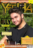 I have a tag down the side of the page "Plus" this is to highlight the additional information. I have included names of big artists in this section to attract a wider audience, names like "Taylor Swift" who is a huge country artist and lots of people idolise her so people would buy the magazine just to read about her. When I included the features in this section I noticed that the text was not all clear so I originally included a shape to border the text but I changed it because the shapes made my magazine look like it was for a younger TA so I removed it. However I then noticed that not all my text was clear because I used a black font and it was over the top of his black top, so I changed the text colour of the text that was over his top so the audience could read it.
 I challenged conventions by having two banners because usually country magazines have one or non. The banner at the top of the page tells people the different stories that feature in my magazine. But I used a different font colour for the different acts so each story stands out to people. I used the red to represent the stories as being important and to highlight the future stars and the ones that are coming through.
In my research I said that I did not like the masthead being behind the model, however I did this in my magazine because I wanted my masthead to be big and I wanted Olly to fill a lot of the page but they got in the way of each other so I decided to place Olly in front of the masthead. I feel that this works because it allowed me too use different tools and help me use them.
 The picture is a medium close up with the artist in the centre of the page which is quite conventional for a country magazine. Also I adhere to conventions by having Olly holding an acoustic guitar which is symbolic of country music, but because I wanted Olly's face to be the main feature I only have a part of the guitar showing.My font for my masthead is a code of a younger, fun audience because of the colours and the serif font type which makes it look more appealing. However because my masthead is fun and cartoon like, it makes my magazine look like it is for a younger TA so this made me lower my TA of my magazine. The font style that I used is called 'figuratitive' which I found on 1001 fonts. I used this font because I felt that it was very artistic and fun, but also because of the lines which made it look like it was made of wood. I wanted this theme/style from the beginning because I felt that the style suited my genre really well.
The font that I used for my headline was different to the font I used for my masthead because I wanted it to stand out to the reader and I wanted to use more of a plain font because that is also quite conventional of country magazines. I supported the theory of Neale "repetition and difference" with this because even though I have used a san serif font, I made it look different by having the same text and font behind it, in a different colour but positioned it so it looks like a shadow of the text. I used the colours black and yellow because I felt that they stood out in front of the green background and I also stood by my colour scheme, by having colours that I use throughout my front cover.
I followed conventions and created synergy by having a wooden theme for my banners and keeping that theme throughout my magazine. I feel that the wood effect works well with my country magazine because the 'wood theme' is very conventional of country magazines because country people usually have a lot of things that are made out of wood like guitars, barns, carts etc. So this is an indexical sign of country. According to Ryall "genre provides a framework". I used this in my magazine because I based my magazines layout and features around the genre conventions of country, by using wooden themes and a natural background. I challenged conventions by having my model wear dark clothing [a black t-shirt] and my masthead having bright colours. The reason I did this was because I felt that a plain t-shirt is conventional of country magazines, however they are usually white so I wanted to change mine and give the audience something different. Also I did this because country magazines usually use bright colours so I wanted to change mine so it is different. But I had my masthead in bright colours so people could recognize that my magazine is a country magazine.
 I manipulated conventions by having Katie [who is a cover story] interacting with my masthead so it appeals to a teenage audience. I feel that it appeals to a teenage audience because it makes my magazine look more fun and in my opinion I think that magazines that have images interacting with masthead are more appealing and make them look more professional. Q magazine use this in their magazines and Q are a very well known magazine and are very popular with all ages.
I decided to have text aligned on my front cover so the text looks more balanced, however I used different sizes and fonts so the audience can recognise what the subheadings are and what the information is. I had the information on Olly in large, bold, white writing because he is the main feature so I wanted it to stand out the most to the audience. Also I used the white font because I think that it works well with my models black top, because if I used a black font then it would be hard to read so I used the opposite colour so I used it as a strap-line and I knew that it would stand out and be easy to read.
I used a box-out to make the text "talks to YEEHA" I wanted this to stand out because it works in cohesion with the text above it "Exclusive interview" so this is letting the audience know that Olly has officially talked to 'YEEHA' magazine so they know that everything that is said inside comes from him. Also it attracts a larger audience because people would want to hear his story and learn more about him. I kept my masthead for the 'YEEHA' in the yellow box so it stands out to the reader and lets them know that it was this magazine that he talked to.I adhered to conventions by having a buzz phrase to capture readers and make the magazine look good. I made it look more fun by having it arched around my masthead which could relate to my magazine and shows the reader that the magazine is fun and jolly. This works in cohesion with my masthead 'YEEHA' because the word 'YEEHA' is a happy, fun and enthusiastic phrase; by having the text bent makes the text suit the mood of the magazine. Originally I had it in a straight line under the masthead but I thought this was boring and did not suit the feel of my magazine.I included a freebie notice on my magazine front cover to attract readers, because as I found out from my TA research more people would buy magazines if they include free stuff. The notice is in a star shape which is symbolic of country and relates to Olly because he is a music 'star'. Also I followed conventions by having a pull quote at the side of my page in a big font to make it stand out so the reader would want to read the magazine, because the text says "the Spice Girls of country" and this will attract people because the Spice Girls were such a big group so if the group in the magazine is being compared to them then they must be good. However originally I had a paragraph of text that was text wrapped to go down Olly's neck, but I changed it because I felt that the text was too small for the reader to read and would not fit on the page if I increased the font size.I adhered to conventions by having a puff on my front cover. My puff has bright colours and is round so it looks like a sun which is symbolic of country because the sun is seen outside in the country. I used this puff as an advertisement to advertise a song inside my magazine. I also put the 'iTunes' logo so people understand where to download it from. I challenged conventions by having my puffs in the corners of the page instead of scattered in the centre. I did this because I wanted Olly to be seen and didn't want him to be covered in text or images. My banner at the bottom of the page featured a lot of things. I included quotes from people inside the magazine which makes people want to buy it more and find out about the star. Also I use it to include an advertisement for Olly's new album and let people know that it is a number 1 album. I also included my barcode and price tag in the banner which manipulates conventions because other magazines usually have the barcode and price above the banner or near the top of the page. I also manipulated conventions by having the dateline above the barcode instead of having it inside the barcode. I did this because I thought that it would be more noticeable and so I could have my dateline going along the top of the barcode and the price tag going down the side of it so they are both angled.
I adhered to conventions because I manipulated Olly's looks by airbrushing him to make him look more attractive to females. I manipulated him by covering spots and darkening his facial hair to make him look cleaner and make his beard look stronger and more powerful. Another reason I did this was to male him look more perfect to readers and give my TA somebody to idolise. Magazines do this to make them look appealing to the audience so people would want to buy the magazine.
 I have a tag down the side of the page "Plus" this is to highlight the additional information. I have included names of big artists in this section to attract a wider audience, names like "Taylor Swift" who is a huge country artist and lots of people idolise her so people would buy the magazine just to read about her. When I included the features in this section I noticed that the text was not all clear so I originally included a shape to border the text but I changed it because the shapes made my magazine look like it was for a younger TA so I removed it. However I then noticed that not all my text was clear because I used a black font and it was over the top of his black top, so I changed the text colour of the text that was over his top so the audience could read it.I challenged conventions by having two banners because usually country magazines have one or non. The banner at the top of the page tells people the different stories that feature in my magazine. But I used a different font colour for the different acts so each story stands out to people. I used the red to represent the stories as being important and to highlight the future stars and the ones that are coming through.
In my research I said that I did not like the masthead being behind the model, however I did this in my magazine because I wanted my masthead to be big and I wanted Olly to fill a lot of the page but they got in the way of each other so I decided to place Olly in front of the masthead. I feel that this works because it allowed me too use different tools and help me use them.

Q2 from Morganbullock
Friday, 8 January 2016


Tuesday, 5 January 2016


Wednesday, 9 December 2015
Sunday, 6 December 2015
Organisation of costumes, make-up and props for photo shoots 1,2 and 3
For my first photo shoot my model wore a black t shirt, denim jeans and a belt with a large buckle. I used the plain black t shirt and denim jeans because I thought it was very conventional and modern for a country magazine. I used a belt with a large buckle because it is very conventional towards theme of western magazines. The props that he used was an acoustic guitar which is an indexical sign for country music, because usually people relate an acoustic guitar to country music, so the guitar keeps conventions.
For my second photo shoot my male models wore a plain t shirt, denim jeans and a check shirt over the top and my female models wore either denim trousers/skirt, a fury coat or a check shirt. These clothes are very conventional and modern. The girls had their hair platted or curly because these hair styles are conventional and will appeal to a male audience. The props that were used were a a banjo, a microphone and an acoustic guitar. The banjo was my favorite prop because it was different, fun, conventional and could relate to my TA a lot.
My third photo shoot has a male in it and he is wearing a check shirt, denim jeans and a plain white t shirt. I felt these would be very conventional and would suit my TA because the check shirt was colourful and appealing. He had an acoustic guitar and a bit of straw in his mouth, which are both iconic signs of country and western.
For my second photo shoot my male models wore a plain t shirt, denim jeans and a check shirt over the top and my female models wore either denim trousers/skirt, a fury coat or a check shirt. These clothes are very conventional and modern. The girls had their hair platted or curly because these hair styles are conventional and will appeal to a male audience. The props that were used were a a banjo, a microphone and an acoustic guitar. The banjo was my favorite prop because it was different, fun, conventional and could relate to my TA a lot.
My third photo shoot has a male in it and he is wearing a check shirt, denim jeans and a plain white t shirt. I felt these would be very conventional and would suit my TA because the check shirt was colourful and appealing. He had an acoustic guitar and a bit of straw in his mouth, which are both iconic signs of country and western.
Organisation of models for photo shoots 1,2 and 3
For photo shoot 1 (front cover) I used Olly because he is a very stylish person so he can relate and appeal to males but also his looks can appeal to females so there would be a mixture of genders buying the magazine. The photo was taken at the wreck in Brigg because it had a lot of open space and it had trees that I could use for my background so the image would focus on Olly. I wanted Olly to gaze at the camera so my magazine would support the theory of Mulvey "the male gaze" so his look would appeal to a female audience.
For my second photo shoot (contents page) I used a mixture of studio and outside picture so it is a bit different and not all the same. I have used a mix of male and female models so it can relate to both genders male and female. The poses that my models are pulling are different in each picture so it shows a range of different skills and shots. For my contents I use a couple of the models twice because I use them as solo artists and them in the same image in a group.
The photo for my DPS is taken in a studio and will fill half of my DPS which follows conventions. I will cut around the image and have the picture of Olly with no background. I have Olly looking over his shoulder gazing at the reader, which creates direct address with them because it is like they are looking right at them.
For my second photo shoot (contents page) I used a mixture of studio and outside picture so it is a bit different and not all the same. I have used a mix of male and female models so it can relate to both genders male and female. The poses that my models are pulling are different in each picture so it shows a range of different skills and shots. For my contents I use a couple of the models twice because I use them as solo artists and them in the same image in a group.
The photo for my DPS is taken in a studio and will fill half of my DPS which follows conventions. I will cut around the image and have the picture of Olly with no background. I have Olly looking over his shoulder gazing at the reader, which creates direct address with them because it is like they are looking right at them.
Equipment for photo shoots 1,2 and 3
For photo shoot 1 and 2 (front cover and contents page) I used the:
- Camera tripod- I used this because it keeps the camera steady so the quality of the picture is better.
- Camera- I used a top quality camera to take the photos so the picture quality is perfect.
I booked the camera and tripod out a few days in advance for both so I made sure I had a camera ready for when I needed it. However for photo shoot 2 I also used artificial lighting because it was taken in a studio so I wanted to make sure the picture was lit up correctly and so it looked more appealing.
Photo shoot plan 3 was taken in a studio so again I used artificial lighting, a camera tripod, a camera and a blank white wall so there was no distractions from the main image. Also it was easier to take photos from different angles, which made the image look more effective.
Wednesday, 2 December 2015
Official front cover draft 1

This was my first draft of my front cover. I have changed this because I did not like the masthead; it was not detailed enough and I do not like how all the letters are not filled in with colour. I also feel that it is not detailed enough to suit my TA because my TA is aimed at teenagers. I also feel that the colour of the headline does not suit the style of the magazine. I also think that the background should be blurred so the main focus is on Olly. Finally I don't like how his face is not airbrushed because it does not follow conventions. I decided to change the image idea that I had in my plan because I thought that if I wanted to connect with a female audience then I need to focus on Olly's looks more than anything.
Friday, 27 November 2015
contents background
 I like this as a background for my contents page. It develops the country rustic feel of the magazine and creates synergy with the front cover and dps.
 Friday, 20 November 2015
Dps write up draft [plan]
Media
Dps plan
- New group[4]
- Upcoming star[3]
- Girlfriend tori Kelly[17]
- Background [1]
- Tour dates[7]
- New album[14]
- Interview quotes[9]
- Dropped capital
- New single[13]
- Gone solo[6]
- Sings and plays guitar as well as drums[19]
- Awards [5]
- What country he performs in [8]
- Where he performs [9]
- Quotes from other people[11]
- Idols
- Fan base[18]
- Social media[16]
- How he came to fame[2]
- Family [10]
- Pull quotes[12]
Actual dps
Oliver Tandon or should I say Olly T! is the new big thing in the country music industry. He is an Indian lad who was born in England. He became fascinated with all music when he was 7 years old and pushed himself to play the drums. He grew up in a small unknown town, in North Lincolnshire and attended the local school where he improved on his drumming skills. He took music at GCSE and overall got an A* mainly because of his drumming and guitar playing skills which inspired him to become a musician.
He went on to become the number 3 guitarist in the country and got a job singing and playing his guitar and drums in a local pub called The White Horse. He then went on to Manchester University to study music for two years, until he finally got his degree. This just shows anything is possible. Oliver joined a band called ‘Different Oceans’ where he was the drummer. They won 3 awards including breakthrough band of the year 2015. After two years of playing in the band he decided that he wanted to pursue in his guitar playing, so he went solo singing. He was taken on by ex-country star Billy Ray Cyrus who described him as “The next me [Billy Ray Cyrus] but better!” Over the past year Oliver Tandon, who goes by the name of Olly T, produced the number 2 Country Album of the year, which included hits such as “Cowgirl” and “Passionate Summers”.
When asked “Who inspired you to become a country singer?” he replied “Well all my life I have been intrigued by the work of Johnny Cash. The song Ring of Fire gave me chills and in my room when I was alone I would dance and sing to his whole album! Haha”
This just shows that you can live up to your idols and your dreams. The interviewer Ben Foster had this to say about him “Oliver…I mean Olly T haha is such a great guy, he is very down to earth and shares the same interests as any teenager. I hope that he goes on to do great things, because I really do believe in him” This just goes to show that this kid has great potential.
Olly is in the line up to get the award for the best country musician. He is up there along with Carrie Underwood and pop cowgirl Taylor Swift. However even though he is new to the country singing life, he is leading the race to the number one spot. He is the most talked about on Facebook, Blogger and Twitter where big stars such as Gary Barlow who tweeted “OMG! You need to hear this new lad called Olly T. He is only 17 years old and he blows my breath away. I mean I have never felt so much emotion in someone’s singing. This guy WILL GO FAR! #OllyTalltheway” This got 2000 re tweets and 4570 likes, which tells us that he has the public behind him.
One girl posted on Facebook a picture of her and Olly T hugging after one of his gigs and post title was, “I love Olly, can’t believe I got to meet him. He is well fit, his cheeks are the most adorable things ever. We will get married someday haha”. He is not only famous from his singing but from his looks as well, very cheeky!
Now listen up! Particularly the girls. Olly T has released his tour dates and where they will be. He is performing all over the UK between the 1st of March and the 21st of January. He will be performing at amazing places such Manchester Arena, O2 arena and Wembley stadium. He has acts such as Arctic Monkeys, The Vamps, Train, Tori Kelly, Disclosure and many more big names. He has been named as a “must see!” act by The Daily Times and even The Sun has given him 5 stars for his performances. So you must go! This will be his second solo tour of his career and he aims to do twice as good.
Even though Olly has risen rapidly to fame, we found out from his interview with ITV he still goes back to his home town and performs in local pubs and parks. “Even though I am going up in the world, I never forget where I’m from and I catch up with the lads and even perform back at home. Then my mum cooks me up a toasty roast dinner haha”.
He has even performed for the Duchess of Cambridge, who said “I am not a huge fan of country music, but I was fascinated by this young boy. He blew me away”. There is even talk of him performing on the X Factor next year. So far he has only performed in the UK, however in 2016 he will be performing all over Europe in countries such as Germany, France, Spain and even outside Europe where he hopes to make it big in the USA!
The second name Tandon is not unfamiliar; his dad was also a star in the music industry. Pav Tandon, was highly known for his Bhangra music back in India. He also won awards for songs such as “Punjabi Skies” and “Praying”. He met Olly’s mum when he came to England to pursue his career as an author. His mum’s name is, Sue who is a teacher at the local primary school. They met when Mo went into her school to talk to the children about one of his new books, then had their first child Rory a year later. Rory is now 25 and is studying at Manchester University, preparing to become a journalist. They had Olly 8 years after Rory and his father was a big influence on him getting into music.
Olly has just released a new music single “Sunshine in the rainforest” which he hopes will be top of the country music charts by the end of the week. The song is currently placed 5th in the charts behind the likes of Taylor Swift and Dolly Parton. In a previous interview we asked Olly about his new song and he had this to say “The song is about me really, how the unexpected happened. I didn’t expect to be sitting in a chair talking to you a year ago and now hear I am”
This song is just one of many from his new album “Broken Ladders” which again reflects his journey. The album consists of 13 songs and is available to pre-order on ITunes. Even though it has not yet been released, it is number 3 in the album charts. Wow!
Billy Ray Cyrus noticed Olly T after he posted the song “Cowgirl” on YouTube and it got over 3000 likes in an hour! He also had a page on Facebook where he would post himself doing covers of other songs like “The cave” by Mumford and sons, “Love Story” by Taylor Swift and “Bruises” by Train. These songs were often shared by his friends and family on Facebook so the videos quickly spread around the country for others to see.
If you thought it couldn’t get better for this lad…then you’re wrong. He also has his own fan page and is going out with pop princess ‘Tori Kelly’ who is famous for her work with Professor Green and the song “Lullaby” which was popular in the UK charts. Olly and Tori have been going out for about 4 weeks now and there is even rumours that they are preparing to release a Christmas song together. So sorry girls he is taken.
Pull quote
“No matter where you are in life, you can still fulfil your dreams”
“If you thought it couldn’t get better for this lad…then you’re wrong”
Thursday, 19 November 2015


Subscribe to:
Posts (Atom)