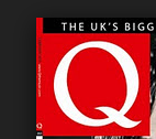
This is the masthead of the cover. It is its main feature of each of the Q magazines. It stands out the most because it is large and has bright colours.

This is the headline of the cover. It is large and red to stand out and gives the sense of danger. It is used as a verb and an adjective, because it is describing her as she 'rocks' but also it is telling us that she is doing rock music so she 'rocks' as in playing rock music. It is also a buzz word to get people going, about her new genre style.
This is additional information added to the front cover to preview other articles inside the magazine and lure the audiences in. There is text that is highlighted to show that it is different from the other text. They use gutters to split up the text to make it stand out and easier for the audience to read.

They use a puff to advertise an inside story about John Lennon. This suggests that it is about a story from the past because John Lennon is dead.
 This is a banner used to advertise the magazine. It is a strapline to make the audience want to read it, by saying that it is the 'biggest music magazine' in the UK which makes the audience think that it is very well known and popular.
The front cover has a centred image and is using Laura Mulvey's theory of 'the male gaze' except it is the other way round because it is trying to attract the male audiences. Also the image has been edited to make her image look better, it is edited by making her lips more red and her hair darker and wetter to make it more appealing. Further more the image has been focused on her face and blurred the background.
I think that also Richard Dyer's theory has been used because she is usually a pop and bright coloured musician, but for this magazine she has been portrayed as a dark and rocky musician.
How it has influenced my ideas and what I like
- The first thing that I like is the effects on the picture to make it look more appealing and effective.
- I like how the the headline is at the bottom and how it is used as a verb and an adjective, to appeal to the audience.
- I don't like how the picture is behind the masthead because it looks untidy and does not blend in well.
- I also like how the puff is in a different colour to make it stand out in the picture.


Add to this - how has this influenced your ideas and creativity?
ReplyDelete