Wednesday, 28 October 2015

My worst pictures from my photos plan


Presentation worst pics from Morganbullock

These pictures are bad because of the quality of them or the look the model is giving towards the camera. In a lot of the pictures the model does not show enough emotion in their face or they are not being serious in the photo.

  • On page 2 the picture on the left is bad because Olly has his eyes closed.
  • The picture in the middle is bad because he is not showing a strong emotion and the background is not fully white.
  • The picture on the right is blurred so it the quality is poor
  • On page 3 the picture at the bottom left is poor because she is not focusing.
  • The picture at the top  left is poor because her tongue covers most of her teeth and doesn't look right
  •  The picture at the bottom right is poor because the background is crumpled and creased 
  • The top right picture is not too bad but I didn't like like how far up her chin is and how she doesn't look relaxed
  • On page 4 the picture is quite good but I feel that it would not connect with my target audience 
  • On page 5 the picture at the bottom right is poor because the models are not synchronised in the way they look
  • The picture at the top is bad because the models are not posing seriously and not all of them look good
  • The picture at the bottom right is poor because one of the models is not looking at the camera  


How this has influenced my ideas

  • I have decided to have some silly pictures in my magazine to show that they are having fun
  • When taking a photo I need to make sure all models are posed correctly
  • I need to make sure I am taking a good quality picture and that the lighting is correct

Best pictures from my photo shoot plan


Presentation of best pics from Morganbullock

I like these pictures because the quality of the picture is good and also I feel that they are using good facial expressions. I also chose these because I think that I can do a lot with them, so that they look good in my magazine. I really like the over the shoulder shot of Olly (the one on the right). I like this image because the lighting is perfect and the models posture is excellent. This is one of my favorite pictures and I am  considering either using it on for a dps or maybe even my front cover of my magazine. I prefer the medium close up shots because I feel that it is close enough to focus on the emotion/expression the model is showing. For most of the pictures I use a direct shot to take the photos, however for a couple of pictures I am using an overview shot to take the pictures because then I could be more creative with the likes of Katies hair. I think these pictures will connect with my TA because they are fun and most of them make eye contact with the camera to form direct address. Also the style of clothing and the pictures are more modern so it can relate to the reader.
How these pictures have influenced my ideas

  •  I am going to change my title so that it matches the style of the pictures.
  • My DPS will be on Olly T now.
  • I will have a mixture of male and female models.

Monday, 26 October 2015

My photo shoot plan 1

This helps me to know what i'm going to do while organising my photo shoot and how I will organise it.


Thursday, 22 October 2015

Maverick contents page 6 country

This is the contents page from the Maverick magazine. It is different from the front cover because it has a white background and the front cover has a dark theme and a black background so it does not match the house style. It has the masthead on this page and the publish date, which do feature on the front cover also. The pictures are at the top right corner of the page in a collage, this leaves plenty of room for text/headlines. Overall the magazine has 112 pages and this contents page is on 2 of the magazine, which is conventional; the contents page is usually 1-3 pages into the magazine. There is 24 story headlines on this page and they are spaced out neatly and more simple so it is more clear to the reader. This backs up the theory of Neale "repetition and difference" because the use of columns and pictures is very conventional, however this is different because the publisher has added the masthead to the bottom of the page to make it stand out. 


The page has a buzz phrase at the bottom, this tells the reader that it is a popular magazine; so many have been made. Also the issue number is in bold to make it stand out to the audience. There are 3 images used on this page to show the audience that they are the main stories. The font is different for the word "featuring", it is more of a fancy font to make it look more upper class. There is a lot of white space on this page because the text is spaced out and all the pictures are in one place. 

I will use this contents page to influence mine. I feel that it a very calm and tidy looking contents page and I really like it.                                                                                                                                                                                                                                   

How this has influenced my ideas
  • I like the font that has been used
  • I like how the masthead is at the bottom
  • I like how the images are collaged together


Maverick dps 3 country


This is a dps from Maverick magazine. The magazine adheres to the same colour theme as they used on the front cover. This creates synergy.


I think that it breaks conventions because the genre seems more rock because of the black background, the electric guitar and the frizzy hair which are all iconic signs of rock and the magazine is a country magazine. The first sentence starts with a drop capital and the text is split up into columns.It uses the same model for both images, however in one image the model is in a studio and the other is taken on a stage. This dps mainly consists of text and is partially filled with images.

This dps covers pages 50 & 51 . The text is aligned left with new roman text, which is a bit less eye catching however it is more traditional, which matches the model because it is an older artist, so the traditional style will suit him. According to Dyer "a star is an image"  and he is represented as an older rock/ country artist. His costume is rock and seems young for him and he is using modern instruments. The headline is his name and it is white because the background is black, so the colour stands out and doesn't blend in.  The font style is an odd choice, it is quiet childish and doesn't really reflect the age of the artist or the in depth language and register used.


The dps has a buzz phrase underneath his name "The Guitar Man at 70" This is a fact that is mean't to shock the audience because you wouldn't think that he would still be playing the guitar at the age of 70.

The shots used are conventional, he is looking into camera in the main image on page 50 and  the smaller image is a left hand low angle shot, both are medium shots. I think that his image has been manipulated slightly, it is more of a natural shot and I feel that the photographer wants to show people what he really looks like now and truly show his age to back up the slogan under his name. The first things that stand out to me is the red guitar. Red symbolises power, love, desire [Barthes] it is a symbolic sign that is polysemous. In this case it could connote his love and passion for his music. This works quite humorously with his white hair which clearly signifies his age. It is interesting that his star image has not changed; it would be expected that he may have died his hair and revamped his image to appeal to a wider TA. However, he has not done this and this could indicate his confidence and perhaps he relies upon his already established image.  

Although the columns are symmetrical, I feel that it does not work having one wide column and one thin; it doesn't look appealing to the audience and is not very conventional.  Also the font seems too modern for the artist, because it is an older artist and the text style relates more to a younger audience. There is a lack of institutional features on the pages; at the bottom there is only the page number and the name of the magazine [Maverick].

How this has influenced my ideas 
This doesn't suit my target audience because of the age of the model,and the colours used.

  • The texts are inside their own boxes

Masthead research 2

This was one of the sheets I printed off to gather information from my audience, on which masthead I should use for my magazine front cover. I gathered information from 20 different
16/17 year olds and the most popular masthead was this one:
So I am going to use this font and name for my magazine.

How this has influenced my ideas

  • I will use the top font and name

Maverick front cover research country 12


 The masthead of the magazine is in San Serif with the first letter in red. The colour red is associated with power and desire, which tells us that this is a powerful magazine. Also it is the only bit of colour used on the front cover, which suggests that the writer wants it to stand out. They have used a puff at the bottom right of the page to advertise the gigs and new releases.

 At the bottom left corner it informs us that there is a freebie inside the magazine, this draws the reader in to the magazine. Overall there are 13 advertisements on the front cover to inform the reader about the stories/articles inside the magazine. It has a barcode, dateline, and price on to tell the reader the date that it was published. I think that it brakes conventions because country magazines are usually bright and happy, but this magazine seems more serious and is in black and white, which makes it look more vintage instead country. It also has a banner at the page to advertise things inside the magazine. The model is using the theory of Mulvey 'the male gaze', because the model is forming direct address with the audience by looking straight at the camera,  so this suggests that it is for a female audience.The picture is a close up shot on the models face and the model has a serious pose to try and attract the reader. The photo has been manipulated because it is in black and white and the colour of the artists beard blends in with the image and the colour scheme of the front cover. I think that about 50% of the cover is filled with text informing the audience about what is inside the magazine. The background is plain and hardly seen, suggesting that the model is the main feature of the front cover and the writer wants the reader to focus on the model.

The model is holding an acoustic guitar however you can only see the head of it, suggesting that the writer could be advertising the name of the guitar "Taylor". I know that this is an acoustic guitar because it has tuners either side of the guitar, which are usually only associated with acoustic guitars.
I feel that the beard is the most outstanding feature in the image because it is unusual for a country magazine, also I think the beard shows power and masculinity, because it is very neat and the colour of it blends with the t-shirt the model is wearing.

The masthead is at the top of the page in big text to stand out to the reader, it covers about a 15th of the page. The main colour scheme for the magazine is black,white and grey which are all usually associated with vintage so it does not follow codes and conventions. The magazine has a slogan "in session with their musical idol" This captures the reader by making the audience think that he is very good or important because they use the word "idol" to describe him and an idol is someone who people look up to.


How this has influenced my ideas

  • I like the idea of the first letter in a different colour
  • I like the idea of the male gaze
  • I like the black and white
  • I like the puff showing advertisements

Country magazine dps 2 country

This DPS is from the magazine 'country'. They have used a picture to completely cover the background and put a column of text down the right side of the DPS. The model is showing the emotion of laughter which tells the reader that he is happy. It uses the phrase "Back to the Fifties" this tells us that theme style is going to be based on the fifties.

This dps does not have much text on, but has a picture that takes up most of the dps, this suggests that the publisher wants the reader to focus on the picture more than the text. The text is new roman and has a san serif font, which is more traditional and less modern. There is a dropped capital at the beginning of the text and the text is very small compared to the text size of the headline. The picture on the wall stands out to me and I think that the man in the picture is the model when he was younger. In the picture the model is wearing sunglasses and the model in the main image is also wearing sunglasses, suggesting that this is a symbol of the artist.

I think that the picture to the left of the model is not there by coincidence. I think that the picture in the background is the model when he was younger and in the picture on the wall there is a man in his sunglasses and the model in the DPS is wearing sunglasses as well so the glasses could be his star sign that represents him. Also because the model is wearing sunglasses, he is breaking conventions because you can't see his eyes. The back wall is wooden planks which is very typical and conventional of the country theme.    

The image is a medium long-shot because it gets all of the model in the image except his feet. The image has been manipulated by adding shadows in parts of the images and adding lights to other parts to make them stand out to the audience. I think that the models clothing is more modern, which could suggest that he is still trying to show the audience that he is a modern artist. The image is taken in a studio and in my opinion everything is in a specific place in the room and not there by coincidence. The DPS is hard filled by text and mainly taken up by the the image.


The image relates to the TA because they have used an older artist, which connects with the older audience.


How this has influenced my ideas

  • I like having a whole image for a background
  • I like having the artist in the centre of the page

Country magazine contents page 5 country

This contents page has pictures of the dps' inside the magazine. This one has been split up into different sections : features, reviews, regulars and charts. This makes it better and easier for the reader, also it makes the presentation of the page better. For the headlines they use bold red writing to make it stand out and tells the reader that it is the title of the story.

This contents page tells me that this magazine has 17 different stories. Which suggests that this magazine is not too big and could be a weekly magazine. This also suggests that this magazine is cheap and is for a middle class audience.


How this has influenced my ideas

  • I like how there is the date on the page
  • I like how they have used pictures of the dps'

Country magazine front cover country 11

This is a more old fashioned country magazine. It has the masthead and headline in a san serif font which is quite traditional for country magazines. The model is wearing old fashioned clothing, which is different from the clothing we wear now days. His jacket is very extraordinary because he has large flower patch on each arm which isn't a fashion design people use now days, also the flower theme buzz phrase at the bottom of the page "FROM AUSTIN TO NASHVILLE AND BEYOND" this is used to lure the readers and make them want to read the magazine. On the front cover it has the barcode, the publish date and the price. It uses Winships direct address with the reader.  
theory of 'the gaze' this makes
could link to the theme of country. He is also wearing a double tie, which is also rarely used now days.


In my opinion the image does not relate to the the masthead as the model is not wearing any stereotypical country clothing. The only country feature on the model is the flower patch on his arm which is a symbolic sign of country. I think this is used to represent the time period of the artists music and to represent the country theme.


The camera shot is a medium close up. This is to capture the models facial expression and the style of the models clothing. The models facial expression is quite smug which suggests that the model has power wants the reader to know this, making them think that he is an important person.He is following  Winships direct address with the reader. 


The image was taken in a studio and not outside as the background is very colourful, however it is blurred so it is hard to see what exactly they are. The blurred background places all the attention onto the model and his expression.


How this has influenced our ideas
  • I like the idea of a buzz phrase
  • I like the date, price and barcode on the front


Ortega Dps page 1 country

This is a double page spread from the 'Country' magazine. 1 half of it is covered by text and the other half is completely covered by a picture. This DPS is completely about 1 artist, it uses her proper name and does not give her a nick name. It uses a dropped capital at the beginning of the first paragraph. It uses a puff to advertise something inside the magazine, and the puff is in a different colour to stand out from the rest of the text. The image expresses nature a lot and uses a mixture of light and dark colours. It has only 1 red item in the image which are the roses and they stand out a lot and red represents power, which shows the artist is powerful. I think that it uses the theory of Dyer "a star is an image" because this is a country magazine and the colour theme of the models clothes are more rock.

This magazine starts on page 26 and goes across to page 27. This tells us that the DPS is near the middle of the magazine and because it has a picture of a girl filling one page which suggests that she is a popular artist and she is one of the big headlines of the magazine.

The text is set out in 4 different columns. However the first paragraph spreads across two columns and has bigger text to suggest that the publisher wants this to stand out most to the reader. I like this idea of having the first paragraph bigger than the others so I will consider using this in my magazine. I have also noticed that after the dropped capital there is bold writing which suggests that each paragraph has its own sub-heading. As you can see there is quite a bit of white space between each column which makes it clear to the reader where one paragraph ends and the other starts.


The text is aligned left as it is on the left hand side of the page and not in the center. This could be because it makes easier to text wrap around the puff in the middle of the page. I like this idea of having a puff in the middle of the page and the text wrapped around the shape. The pull quote is placed in the middle of the page and in the middle of the text to stand out as an important feature of the magazine page.

The body of text is small compared to the headline of the page. I think this is done to let the heading, the sub-heading and text body stand out so the reader knows which is which.

The image is a medium long-shot of the girl. I think this is because the photographer wanted to only capture the clothing and the features of the models face. I think that the main feature of the image is the red roses on the models head because the rest of her outfit is black. However it creates synergy with her red lipstick that she has on which represents power. Also the roses work in cohesion with the background as there is a natural background with a bush which is where roses come from/are found by. The model has a happy but cheeky look and is in very short clothing suggesting that the model is trying to attract a male audience with her good/flirtatious looks.


How this has influenced my ideas

  • I like the puff in the middle of the text
  • I like how it is half text and half image
  • I like the idea of dropped capitals   

Dolly Parton contents page 4 country

This is the contents page from 'Country' magazine. It has a very vintage look about the image, I think this because black and white images are used and the style of clothing is vintage but also western. A lot of the page is taken up by a picture of Dolly Parton, who is also the model they used for the front cover of the magazine. All the text is down the right side of the page and the pictures next to it. Also the number on the large image is in a different colour to tell the audience that it is the main story.
This is not appropriate for my target audience because it has a style that suits an older audience.
The contents does not have the magazine name on it, however at the bottom right corner of the page is has the website for the magazine, which suggests that even though the images and models look like they are targeted at an older audience, they could be trying to attract a younger audience as well as younger people tend to use the internet more than older people.

I think that the publisher used this image because it shows how she used to look when she was younger. I think this works in cohesion withy the front cover as the publisher is trying to create a message that she is still as good looking as she was when she was younger.

Other pictures on there do not stand out as much because they are smaller and their page numbers do not stand out as much. I like this picture of 'Jimmy Webb' under the picture of Dolly. I like this picture because of the way the model is positioned playing the piano; the piano boars is coming up over his head so it shows the top half of the model which looks like the piano is being used to frame the model.

This magazine is different and not very conventional as it has the contents page on two sides back to back. This is different as contents pages are usually one sided or are spread across two pages next to each other.

The layout of this side matches the front cover because it is not dominated by text and focuses on the image of Dolly Parton, which is the same as the front cover because there is hardly any text on the front cover, only a picture of Dolly which suggests to the audience that the magazine is about representing her and her good looks.


This contents page supports the theory of Neale "repetition and difference" because there are many contents pages with this theme of text down the side and a large picture next to it. However this is different because it includes reviews and more pictures at the bottom of the page.


The model has exotic clothing on which stands out to the audience because it is different and eye catching. This proves Mulveys theory to be correct because the model is using "the male gaze" which could be to attract a female audience to the page. The page has a puff next to the model to say who it is and what page in the magazine he is on.

The model is holding the guitar differently to how people would usually hold it. He is holding it by its neck and people usually hold it by its body, so he is breaking conventions. This image has been manipulated to make the model look good by, air brushing him so he has clear skin and it look like he has been cut out and pasted on a plain white background so people focus on him. At the top of the page there is the dateline that the magazine was published, which is also on the front cover. 

Overall there are 20 different stories in this magazine, which suggests that this magazine is produced monthly instead of weekly as it has so many features inside. This also tells us that the magazine will be more expensive as it is longer than weekly magazines so they will want to make more money from them.

There are 3 different sections on this contents page: features, regulars and reviews. The features and regulars are sectioned out so they go down the side of the page next to the images, but the reviews are different as they go along the bottom of the image. This could be because the publisher wanted to fit them all on one page and wanted to have more   images to go with the features. Also I think this is done because they did not want to squash the image of 'Marty Stuart' as they want him to be a stand out feature on the page.

Both contents covers are dominated by images as they want to attract the audience with images as the magazine wants to represent the models and their good looks. Also there is a lot of pictures on this page suggesting that the publisher wants the audience to focus on the images .

Dolly Parton front cover country research country 10

This is a country magazine with Dolly Parton on the front who is a more vintage artist but the photo is more modern. The masthead of the magazine has a serif font, which is traditional for country magazines. However the headline is San serif which matches the style of Dolly Parton because she is an exciting artist, and I can also tell this because of the way she is dressed because she is wearing an exotic shirt, that is different from usual country clothing. 
It has a barcode at the bottom right of the page which tells us the date and the cost of the magazine. Most of the text is a the top of the page in a banner which gives us a quote from inside the magazine. The magazine uses a plain background to draw the attention to the model, also the model is very bright. She is wearing a bright blue top which shows health, this links to Dolly Parton in this image because she is trying to show that even though she is getting older, she still looks good. The model is doing an 'over the shoulder' look and is not looking into the camera. The models look, I feel is pretty natural, however she is wearing a lot of make up and I think that her face has been edited to make it shine and to make the model look good. The image is in colour which could suggest that it as modern magazine and it has a plain background to make the model stand out from everything else. Also the model fills most of the page, which also tells us that the model is the main focus.


At the top left corner of the page there is one of the logo for one of the brands who published the magazine, this is at the top left because it wants the reader to see who presented the magazine however they did not want it to over shadow the main headline.
Also at the bottom left corner next to the barcode there is the magazine institute logo for 'TeamRock' this tells us that this magazine was produced by 'Classic Rock'.Even though I can only see half of it I recognise that it is 'Team Rock' as it is a well known brand and has a well known logo.
At the top of the magazine front cover there is a pull quote from an artist; Dolly Parton is the main feature of the magazine and there is no other feature on the front cover suggests that the quote is from Dolly. However this can be used to draw readers in as they will want to know who said it so they will read the magazine to find out.
Under the masthead at the top of the page is a subheading to go with the masthead of the magazine "music magazine no 2" because it states that this is the second magazine, it suggests to the audience that the first magazine went well so they made a second one. This attracts the audience from the previous magazine because if they enjoyed the first one so much then they will want to read the second one. I like the idea of this text being behind her head as it is noticeable but does not get in the way of her image.

Institution/Distributor 
As I said before this magazine is produced by 'Classic Rock' who are a 'Team Rock' magazine company. However the magazine was distributed by 'Seymour Distribution ltd' who are the largest distributor of UK magazines internationally. This suggests to the reader that this is a very popular magazine as a big name distributor has taken it on. 

'Team Rock' are a big institution as they have produced well known companies like "Metal Hammer" and "Classic Rock" which are their two biggest name companies. However even though they produce rock magazines, they also produce blues magazine. One of their magazines is called "Blues" which is another big name brand that 'Tea Rock' produced but it is not as successful as their rock magazines.  
Even though I have analysed this magazine institute, I will not consider them for my magazine as my magazine targets a younger and more peaceful audience.

How this has influenced my ideas
  • I like the idea of having a blank background
  • I like the idea of exotic clothing


Wednesday, 21 October 2015

Morgans Media Magazine institute (hw) 1

Bauer Media Group

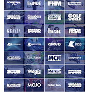
Bauer media are a huge magazine institution who sell more than just music magazines. They produce many big name magazine companies all over the UK. As you can see here they produce music magazines like 'Kerrang' but they also they produce gossip and football magazines like 'heat' and 'Match'. This tells us that Bauer are an institute that produces big name companies for any genre of magazine.


They have a buzz slogan to attract a larger TA. This slogan lets the audience know that they are known for being very influential and because they have it in big bold writing on the home page of their website, tells us that they are proud of this achievement and want this to be the first thing that the audience reads so it will draw them into the magazine site.


This is one of the magazines that they do. This shows that they do magazines on the genre of rock. I know this because Metallica are a famous rock group. Also the magazine has very large title with a font which relates to the group.
They have focused their front cover on Metallica, which suggests that their focus is on this group, which tells the audience that the magazine is about Metallica and rock. The fact that the magazine is about rock, suggests that the target audience is for teenagers and adults, because rock groups can be explicit. It is most likely also it is targeted at music/rock music lovers.


This is also one of the magazines that they do. The magazines show that they focus on pop music as well as rock, however Biffy Clyro is a pop/rock artist, which suggests that the institute focuses on rock. I think the target audience for this, is again teenagers and adults, because of the dark theme it has and childrens magazines tend to have bright colours.


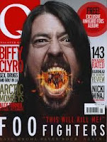
This is Q magazine who are published by . This magazine suggests that they focus on rock groups because it has Dave Grohl on the front cover, who is the lead singer of a group called the Foo Fighters. The theme of the magazine suggests it is for teenagers, because of the dark colours and the  colours coming out of Dave Grohl's mouth. I think that it is meant to be fire and the band coming out of his mouth, which in my opinion relates to the genre of rock. Another reason I can tell the magazine is about Foo Fighters, is that the bands name is in big, bold letters, with a clear font, at the bottom of the page. On the cover of the magazine, I can also see that inside the magazine it features information about Nicki Minaj who is a pop artist, which suggests that also the magazine features information about pop music, as well as rock.


Overall I think that this institute focuses on rock music. I think this is because most of their magazine front covers feature pictures/information about rock bands. This also suggests that their target audience is older children because of some rock bands explicit content and dark themes.
Also Bauer Media Group have their own radio and TV stations as well as well as their magazines, which are sold and presented in over 15 countries.


TimeInc.UK/IPC Media

This institute produces many different magazine companies such as big name companies like Uncut and NME. As you can see this institute produces many different magazine companies. This tells us that this magazine company is big and is very popular. TimeInc was formally known as IPC Media until it was bought out and in 2014 it was formally known as TimeInc.


This tells us that they target an adult audience and they are a global institution. The magazine institution uses this slogan to attract a larger audience by letting them know that they are a big institution. 


This is a magazine that focuses on pop music. I know this because Paramore are a worldwide famous pop group and the magazine shows us that it is a music magazine by presenting a giant picture of the group and using large, bright font to make it stand out to audiences. The magazine has a mixture between dark and bright colours, which suggests that is targeted at children and teenagers. However the font that is used is large and clear which suggests that it could be for older ages, because it makes it clearer and easier to reads. Also because the background colours are darker could suggest that it is targeted at older audiences.


This magazine focuses on guitar playing, instead of vocal music. This has a very dark theme which suggests that it is for older audiences. The title is large and has a font that relates to the genre of the magazine. From the title and the picture, I can tell that it is a music magazine and is about guitars. The title also helps me understand this because of its size, it makes it clearer to understand.  


Overall I think that IPC focus on pop/rock groups. They tend to have a mixture between dark and bright colours in their magazine covers, which suggests that they like to publish magazines for a variety of different ages. 
IPC Media mainly work on magazines and books. In total they sell 350 million copies beach year which suggests that they are a huge world wide company.


 I think that bauer magazines focus on rock and pop themes/music. They have used dark colours in their magazines which relates to rock music, because allot of rock music is seen as dark music. I think they are targeting teenagers, because they have used groups who have been around and playing music for a while, also who are still playing music now. 


I feel that the institute that suits my magazine the most is TimeInc. I think this because they produce more country magazines and less rocky themed magazines, so because my magazine is a country and western, this institute suits it the best and would most likely publish mine.